Near the top-right corner of every Baseball Savant pitcher page, there is a scatter plot labeled "Movement Profile (Induced Break)." It's a circular grid measured in inches, with different colored dots scattered around it in bunches. Tons of folks see it, but get nothing from it before moving on to the numbers they recognize. And who can blame them? It can be pretty tough to interpret even if you've been watching baseball for years.
Paul Skenes — Baseball Savant Pitcher Page (2025)
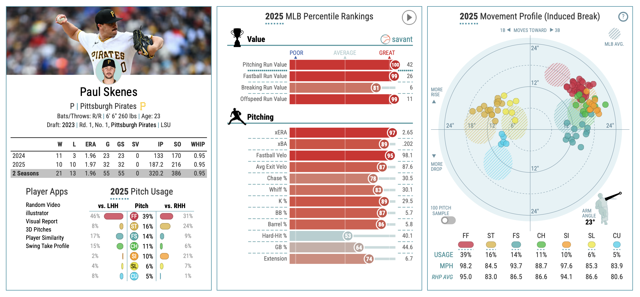
The top of Skenes's Savant page. Left: player card with basic stats and pitch usage. Center: 2025 percentile rankings across pitching categories. Right: the Movement Profile.
The Movement Profile chart is the best visual representation of how a pitcher actually attacks the strike zone. It shows you the geometry of their arsenal: which pitches go where, how they move, and how they relate to each other. That's the theory of the attack, laid out visually, and it's how pitchers fool and overpower batters.
Two pitchers make the clearest possible case for why the chart matters. Paul Skenes of the Pittsburgh Pirates and Logan Webb of the San Francisco Giants both pitched at an elite level in 2025.
On the surface, many of their 2025 stats are pretty similar. Skenes walked about 5.7 percent of batters while Webb walked 5.4 percent. Both guys had a SIERA in the 3.10s, and both have excellent Stuff+ and Location+ numbers. Maybe the most obvious difference lay with their ERA: Skenes maintained a spectacular 1.97 ERA, while Webb's ERA was 3.22.
Fans of the game know that Skenes and Webb are different pitchers with different tools and different approaches. The Movement Profiles help show exactly how different: they reveal the geometry behind how each pitcher wins.
The Origin
The Movement Profile chart plots each pitch by how much it moves, compared to a theoretical baseline, in two directions: horizontally (left-right) and vertically (up-down). Each axis is measured in inches. The chart's underlying grid is circular, with dotted rings marking 12 and 24 inches from the center.
The Movement Grid — Orientation
The movement grid. For a right-handed pitcher, the arm side is right, the glove side is left. The center (0,0) represents a theoretical spinless ball: not no movement, but no spin-induced movement.
The chart shows everything from the pitcher's perspective. A lot of people get tripped up because they assume it's drawn from the catcher's view. Imagine you're watching a game on TV with the camera behind the pitcher. Pitch movement starts to make a lot more sense from there.
The center of the Movement Profile is called the origin. The (0,0) origin doesn't mean a pitch has no movement. It means a pitch has no spin-induced movement. No real pitch lives at the origin. Gravity still acts on every pitch, and every pitcher imparts at least some spin to the ball. The distance from center tells you how hard that spin is working.
Horizontal and Vertical Movement
The horizontal axis of the chart is pretty straightforward. The farther a pitch breaks toward the arm side or glove side, the farther its dot sits from the vertical center line.
The vertical axis is where the chart requires a small correction to the word "rise." Contrary to legend, a pitcher can't throw a ball so hard that it actually moves up. But they can throw a ball so hard that it appears to rise by not dropping as much as other pitches. This is called induced vertical break, or IVB.
How Movement Appears on the Chart
The colored circles show where typical pitch types actually plot: four-seam fastball in the upper arm-side quadrant, sinker at the midline arm-side, curveball in the lower glove-side quadrant. The concentric rings mark 12 and 24 inches from center.
IVB is the vertical movement caused by spin, calculated by comparing the pitch's actual vertical path to that of a theoretical spinless ball traveling at the same speed on the same initial trajectory. Gravity is removed from the equation. What remains is the Magnus effect, the force generated by spin, pushing the ball up or pulling it down.
A four-seam fastball with an IVB of +20 inches does not actually climb 20 inches. It simply falls 20 inches less than gravity alone would produce. A fastball thrown at 98 miles per hour arrives higher in the zone than the hitter's brain predicts, because the brain naturally accounts for gravity that the ball's backspin has partially cancelled. That's the optical illusion hitters call a "rising fastball."
On the other hand, a curveball with an IVB of -12 inches falls harder than gravity alone would produce because it has topspin that pulls the ball downward through the zone. As a result, curveballs appear below the horizontal axis.
Here's a fun fact: sinkers still plot above center, because they have backspin like a four-seamer and still "rise" relative to a spinless ball thanks to the Magnus effect. The "sink" comes from the fact that they rise less than a four-seamer does, so compared to what a hitter expects from a fastball, the ball arrives lower than predicted. As a result, a sinker will appear above the horizontal axis, but not as high as a four-seam fastball.
Skenes FF vs. MLB Average Four-Seam (2025)
Skenes's four-seam fastball (solid dots) plotted against the MLB average four-seam zone (hatched). Both clusters sit roughly 18 inches from the center of the chart, but at different angles. The average FF points more toward the top of the grid: more rise, less run. Skenes's FF points more toward the right: more run, less rise. His 14 inches of arm-side run is nearly double the MLB average; his 11.6 inches of IVB is below it.
The hatched zones on the chart — the diagonal-striped ovals — mark where the average MLB pitch of each type typically lands. When a pitcher's dots sit outside those zones, that pitch moves more than league average in that direction. Skenes's four-seam fastball is a useful example. His FF generates about 14 inches of arm-side run, well above the MLB average of roughly 8 inches for a four-seamer. His IVB, at 11.6 inches, actually sits below the average for a four-seam fastball. The outlier position of his FF cluster on the chart is driven almost entirely by that exceptional horizontal run, a product of his low 23-degree arm angle, not by unusual rise.
Paul Skenes
Paul Skenes — Movement Profile (2025)
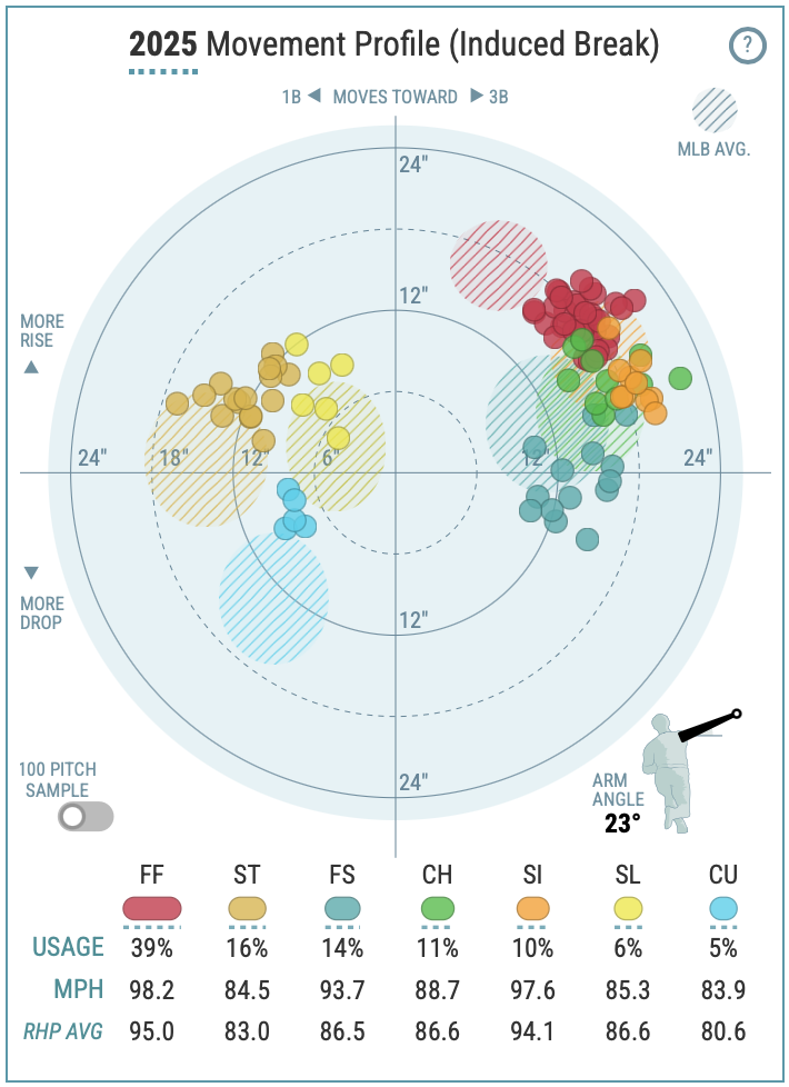
Skenes's chart from Baseball Savant. The four-seam fastball (FF) plots in the upper-right quadrant; the splinker (FS) plots near the horizontal midline, arm-side. The sweeper (ST) plots far glove-side. Also visible: sinker (SI), changeup (CH), slider (SL), and curveball (CU). The shape of the arsenal is predominantly vertical.
Paul Skenes — 2025 Pitch Arsenal
| Pitch | Abbrev. | Velocity | Horizontal | Vertical |
|---|---|---|---|---|
| 4-Seam Fastball | FF | 98.2 mph | +14.0" arm | +11.6" rise |
| Sinker | SI | 97.6 mph | +17.5" arm | +6.4" rise |
| Splinker | FS | 93.7 mph | +13.4" arm | 0.0" |
| Changeup | CH | 88.7 mph | +16.6" arm | +5.4" rise |
| Slider | SL | 85.3 mph | −3.3" glove | +7.6" rise |
| Sweeper | ST | 84.5 mph | −11.4" glove | +5.7" rise |
| Curveball | CU | 83.9 mph | −6.1" glove | −2.6" drop |
Dot colors match the chart above. Horizontal: arm = moves toward a right-handed batter, glove = breaks away. Vertical: rise = falls less than a spinless ball would, drop = falls more.
Paul Skenes's chart looks like someone stacked two pitches directly on top of each other.
His four-seam fastball, the dominant red cluster of dots, plots in the upper-right quadrant: 11.6 inches of induced vertical break, with 14 inches of arm-side run towards third base. His splinker plots almost exactly on the horizontal midline, at zero induced vertical break, with 13.4 inches of arm-side run. The two pitches travel on nearly identical horizontal paths and arrive 11.6 inches apart vertically.
Paul Skenes — Primary Arsenal (Simplified)
Skenes simplified: four-seam fastball, splinker, and sweeper. The fastball and splinker sit on nearly identical arm-side paths, 11.6 inches apart vertically. The sweeper plots glove-side.
Here's what it looks like to batters: both pitches leave Skenes's hand on approximately the same release plane, from the same arm slot, at similar initial trajectories. From the moment the ball leaves his hand, both pitches look like a 4-seam fastball coming in hard about chest high. But just before the splinker ball reaches the plate, the ball drops sharply and ends up at the ankles.
Why is this so important? A hitter typically has less than 400 milliseconds from the moment the ball leaves the hand to decide whether to swing. He cannot wait to see where it's going. He has to commit quickly to a vertical half of the zone: is the ball coming in high or low? What makes Skenes so effective is that he throws pitches that live at both ends of that zone.
Skenes' fastball is elite: he can throw it over 100 mph and it has good movement. If the fastball was all Skenes had, many batters would still have trouble hitting it. But when you couple that with a splinker that looks exactly like the fastball but comes in about 5 mph slower and drops 12 inches at the last second, it makes both pitches even more effective. This approach is called pitch tunneling.
The 2025 numbers confirm exactly what the shape predicts. K% at 29.5 percent, 89th percentile. Whiff rate at 30.1 percent, 83rd percentile. Barrel rate suppressed to the 86th percentile. All season long, hitters were consistently making contact in the wrong part of the zone, rolling over pitches they thought were up, or getting under pitches that dove. Skenes has five other excellent pitches in his arsenal on top of all that.
His sweeper grades as his single best pitch by raw Stuff+ (131). Against a hitter who has committed to guessing height, it breaks sideways into a different problem entirely.
What makes the chart look the way it does is the separation. Two pitches with nearly identical arm-side run landing at different heights, and another moving along another axis to keep the hitter guessing. The fastball arrives above the midline; the splinker arrives right at it; the sweeper arrives on the other side of the plate.
Skenes was 23 years old in 2025. He had, at that age, one of the most clearly differentiated movement profiles in baseball.
Logan Webb
Logan Webb — Movement Profile (2025)
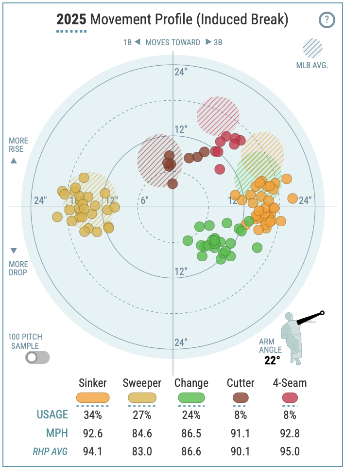
Webb's chart. The sinker plots right of center, arm-side. The sweeper plots far left, well past the glove-side boundary. The shape is wide rather than tall.
Logan Webb — 2025 Pitch Arsenal
| Pitch | Abbrev. | Velocity | Horizontal | Vertical |
|---|---|---|---|---|
| 4-Seam Fastball | FF | 92.8 mph | +9.0" arm | +10.7" rise |
| Sinker | SI | 92.6 mph | +15.7" arm | +0.5" rise |
| Cutter | FC | 91.1 mph | +2.0" arm | +7.7" rise |
| Changeup | CH | 86.5 mph | +8.5" arm | −5.6" drop |
| Sweeper | ST | 84.6 mph | −14.6" glove | −0.5" drop |
Dot colors match the chart above. Horizontal: arm = moves toward a right-handed batter, glove = breaks away. Vertical: rise = falls less than a spinless ball would, drop = falls more.
If you pull up Logan Webb's chart before understanding what you're looking at, the fact that he's an average-velocity pitcher would lead you to underestimate his talent. There's no towering cluster near the top of the vertical axis to suggest he's blowing away guys with his fastball. Plus, his four-seam fastball velocity is 92.6 miles per hour. That's the 23rd percentile. He isn't overpowering anyone.
The real story is on the X-axis.
Webb's sinker plots well to the right on the chart, arm-side, running in toward a right-handed batter's hands at 92.6 miles per hour. His sweeper plots far to the left, well past the glove-side boundary, breaking off the outside edge of the plate. When you look at the two dots, they sit at nearly opposite ends of the horizontal range. Whereas the shape of Skenes' chart is tall, the shape of Webb's chart is wide.
Logan Webb — Primary Arsenal (Simplified)
Webb simplified: sinker and sweeper. The sinker runs arm-side; the sweeper breaks far glove-side. The horizontal spread between them is roughly 30 inches.
So what does this look like to a hitter? Like Skenes' four-seam/splinker combo, both of Webb's pitches come out of his hand in approximately the same delivery window. The sinker ends up running towards Webb's arm side, while his sweeper ends up breaking off the plate thirty inches to his glove side. If a hitter is sitting on the sinker they get the sweeper. If he's sitting on the sweeper he gets the sinker. Either way, he's covering the wrong half of the plate.
Webb's ground ball rate is the direct result of this design. In 2025, 54.2 percent of balls put in play against Webb went on the ground, 91st percentile of the league. A hitter who gets jammed by a sinker running in tends to hit the top of the ball. A hitter who reaches for a sweeper breaking away tends to roll over. Both outcomes produce ground balls. The chart predicts the statistic before a pitch is thrown.
Webb's changeup serves the same purpose as Skenes's sweeper: it solves the problem created by having only two pitches in play. Without it, you could theoretically look for the extremes and wait. The changeup drops vertically at a different speed than either breaking pitch, occupying a third territory on the chart, at a different depth. The result is that three primary pitches cover three distinct zones: arm-side, glove-side, and down.
Logan Webb — Three Zones
Webb's three primary pitches: sinker (arm-side, horizontal midline), sweeper (glove-side, horizontal midline), changeup (arm-side, below midline). Each dot occupies a distinct zone on the chart.
His xERA in 2025 was 3.58 against an actual ERA of 3.22. His xFIP was 2.78. His BABIP was .346, roughly 45 points above average, suggesting that some of his well-placed contact found gaps rather than gloves. The xFIP says he pitched better than his ERA indicates. The Movement Profile says the underlying arsenal is legitimate. The .346 BABIP is the anomaly, not the pitch design.
He works at 92 miles per hour. He is one of the cleaner examples in modern baseball of a pitcher who never needed velocity to be elite. The chart explains why.
Two Shapes
Skenes vs. Webb — Two Arsenal Shapes
Left: Skenes's vertical shape — fastball above the midline, splinker on it, sweeper glove-side. Right: Webb's horizontal shape — sinker arm-side, sweeper far glove-side.
Put the two charts side by side and the difference is immediate.
Neither shape is superior to the other. They work on different principles and produce different statistical profiles. Skenes is a strikeout pitcher because his vertical gap creates swings at pitches outside the zone, or contact in the wrong part of it. Webb is a ground ball pitcher because his horizontal spread creates rolled-over contact and weak grounders.
Both of them were elite in 2025. The Movement Profile tells you why before a pitch is thrown.
Reading Any Arsenal
The next time you open a Baseball Savant pitcher page, start with the Movement Profile. How much separation exists between the pitch clusters?
The first thing to check is whether the clusters are all bunched together. A pitcher whose entire arsenal occupies a small area of the chart is giving hitters a narrow window to track. He may still be difficult to deal with if his velocity is high or his command is exceptional. But he isn't working with the kind of geometric deception that Skenes and Webb show. Pitches that live near the origin — close to (0,0) regardless of velocity — are the specific red flag. A pitch with limited induced movement behaves predictably: it falls roughly where gravity says it should, and hitters can time it without committing to a guess about height or side. High velocity can partially compensate, but the chart is telling you something the radar gun isn't.
Once you see real separation, the direction of it matters. Vertical separation — a tall shape, clusters spread from top to bottom — predicts strikeout upside. The more vertical ground the hitter has to cover, the harder it is to commit to a swing plane. Horizontal separation — a wide shape, clusters spread arm-side to glove-side — predicts ground ball rate. The wider the spread, the more a hitter is forced to guess a side of the plate, and a wrong guess tends to produce weak contact in the dirt.
The chart doesn't tell you whether a pitcher will stay healthy, or how he'll adjust when opposing teams have three months of film, or whether the command holds in August. Next time you see a pitcher's numbers and want to know if they're real, open Savant and check the shape. Separation is the signal. The rest is details.